How To Choose Paint Colors: A Room-By-Room Science Guide
Color Selection Strategies For Each Space From Portland, Or To The Coastline
Introduction
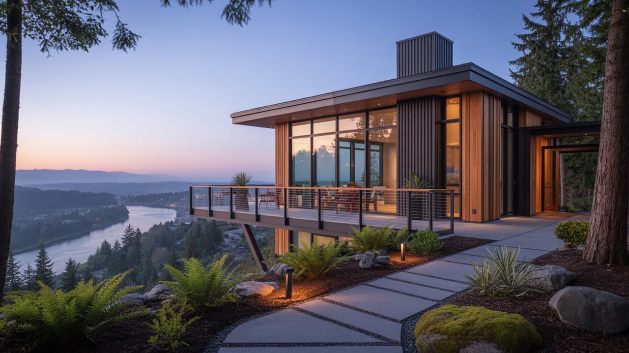
Choosing paint colors blends observation, measurement, and testing. In Portland, OR, where natural light changes with the seasons, color decisions affect mood, perceived size, and home-buying appeal. The following sections outline practical steps for selecting hues room by room. Each section explains the science behind color choices, gives clear examples, and offers actionable tips that relate to local light conditions and buyer preferences.
Room Lighting Assessment
Understanding Light SourcesMeasure the amount and quality of light in a room by noting window orientation and artificial lighting. North-facing rooms often receive cooler light. South-facing rooms tend to have warmer light most of the day. Observe the room at different times to see how colors shift. Use samples on walls rather than cards to view real-life effects.
How Light Alters Color PerceptionDirect sunlight can make pigments appear more intense, while overcast light softens tones. LED bulbs with high color rendering make shades closer to their true appearance. Incandescent bulbs warm hues, which can be useful in rooms that need a cozy atmosphere. Choose test patches and photograph them under each light condition.
Practical TipPaint large test swatches and live with them for several days. Rotate lighting scenarios and take notes about which tones remain pleasant during morning and evening hours.
Room Function And Desired Atmosphere
Match Color To PurposeSelect colors based on how the room will be used. Restful spaces benefit from muted shades that reduce stimulation. Active spaces perform well with lively tones that energize activity. Work areas require colors that improve focus and contrast without strain.
ExamplesA reading nook may use a subtle shade that reduces glare. A home office might use a soft cool tone that enhances concentration. A kitchen can handle a brighter color that stimulates appetite and conversation.
Actionable TipList the primary activities for each room and pick a primary color family that supports those activities.
Scale And Proportion Considerations
Adjust Color To Room SizeLight colors can open up compact rooms, making them feel airy. Darker colors can add depth and drama in large spaces. Ceiling color also affects perceived height; a slightly lighter ceiling can make a room feel taller.
ExamplesA small bathroom painted in a pale shade will appear larger. A formal dining area painted in a richer tone can feel intimate without appearing small.
Practical TipUse a scale test by painting a full wall with the candidate color to judge how proportion interacts with tone.
Choosing A Base Palette
Establish A Cohesive FoundationStart with a neutral base that ties the home together. Neutrals can be warm or cool and serve as anchors for accent colors. Use undertone analysis to ensure adjacent rooms flow visually.
How To Identify UndertonesCompare the neutral against warm and cool samples. If it leans toward gold, choose complementary warm accents; if it leans toward blue, select cool complements. Undertones show more clearly in natural light.
Actionable TipSelect one neutral for common areas and vary saturation to create visual interest without losing cohesion.
Accent Walls And Focal Points
Use Contrast With PurposeAccent walls can highlight architectural features or focal furniture. Choose a color from the same family as the base palette for harmony or a contrasting hue for impact. Consider the visual weight of the accent relative to the room’s size and lighting.
ExamplesA deep shade behind a media wall can reduce glare and frame the screen. A saturated color on a single wall can anchor a seating area without overwhelming the space.
Practical TipApply the accent to a wall that is naturally read as a focal point, such as the wall with a fireplace or the wall opposite the entrance.
Trim, Ceiling, And Detail Colors
Select Supporting ColorsTrim and ceilings frame the primary wall color and should enhance rather than compete. White trim often offers crisp definition, but off-white or tinted trims can create warmth or softness. Ceilings painted slightly lighter than walls maintain height while feeling intentional.
ExamplesA soft warm trim can harmonize with a warm neutral and make wood tones appear richer. A cool trim with a cool wall can emphasize a sleek, modern aesthetic.
Actionable TipTest the trim color adjacent to both wall color and natural wood finishes to ensure compatibility.
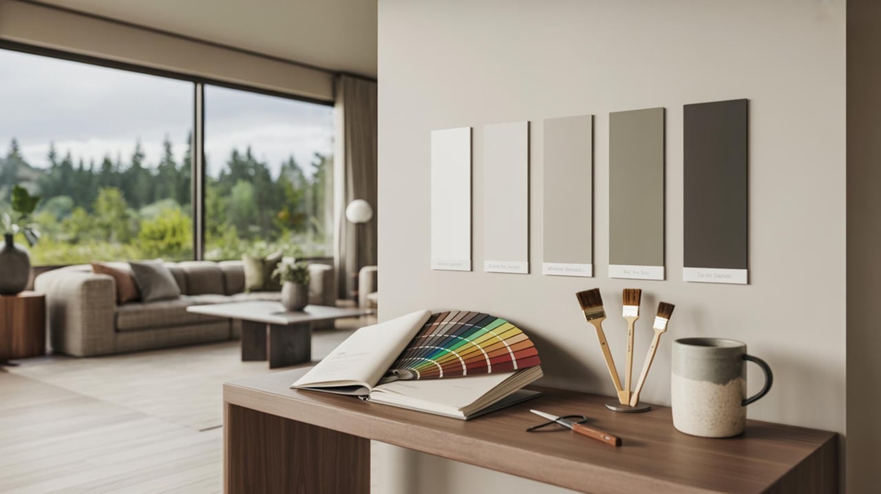
Testing And Sampling Methods
Controlled Sampling StrategyPaint large patches in multiple locations within the room to account for light variation. Observe each sample for several hours across different days. Use painter’s tape to section off areas and label samples to avoid confusion.
ExamplesTry three variations of the chosen color: one desaturated, one mid-saturation, and one more vivid. Viewing them side by side reveals which intensity works best.
Practical TipKeep a log of impressions and photos under different lighting to compare candidates objectively.
Color Psychology And Emotional Effects
Apply Color IntentionsColors influence perception and mood through associations and visual temperature. Warm hues often feel inviting and active. Cool hues generally feel calm and restorative. Saturation and brightness further adjust emotional impact.
ExamplesA muted warm shade in an entry can create a welcoming tone. A cool medium shade in a bedroom can promote relaxation. A lively accent in a play area can stimulate energy.
Actionable TipDefine the desired emotional outcome for each room before selecting specific shades.
Coordinating With Furnishings And Finishes
Harmonize With Existing ElementsConsider permanent elements such as flooring, cabinetry, and countertops when choosing paint. Undertones in wood or stone often set the direction for paint selection. Metallic finishes and fabrics also interact with color choices.
ExamplesHardwood with red undertones pairs with warm neutrals and complements. Cool-toned tile favors cooler wall hues to maintain balance.
Practical TipBring fabric swatches and sample tiles into painting trials to see how materials and colors perform together in the same light.
Local Climate And Seasonal Light In Portland
Account For Regional Light PatternsPortland’s climate features many overcast days and a distinct seasonal shift in daylight. Colors that appear lively under bright sun may read differently during extended cloudy periods. Select shades that maintain a desirable appearance under soft, diffuse light.
ExamplesA medium-toned color with balanced undertones tends to read well year-round. Lighter tones can compensate for darker winter light and preserve a sense of brightness in interiors.
Actionable TipView test patches during typical local weather conditions. Simulate daytime lighting and evening lighting to ensure consistent results.
Working With Professionals And Tools
When To Consult ExpertsColor consultants and paint professionals can provide expertise in color theory, product selection, and application. They can offer digital renderings, physical mockups, and recommendations for finishes that hold up to use.
ExamplesA consultant can advise on achieving color continuity across connected spaces. Painters can recommend sheens that resist wear in high-traffic areas.
Practical TipRequest references and view previous projects that show completed rooms under real lighting. Ask for sample boards to compare options before final decisions.
Final Thoughts on Color by Room
Choosing paint is part science, part art, and wholly personal — but with the room-by-room approach you can make confident, cohesive choices that enhance light, mood, and flow. Keep samples up, view them at different times of day, and prioritize how each space will be used to guide your palette. For personalized color plans tailored to your needs (target location: null), reach out to and.